Looking at all of the Dot Plots
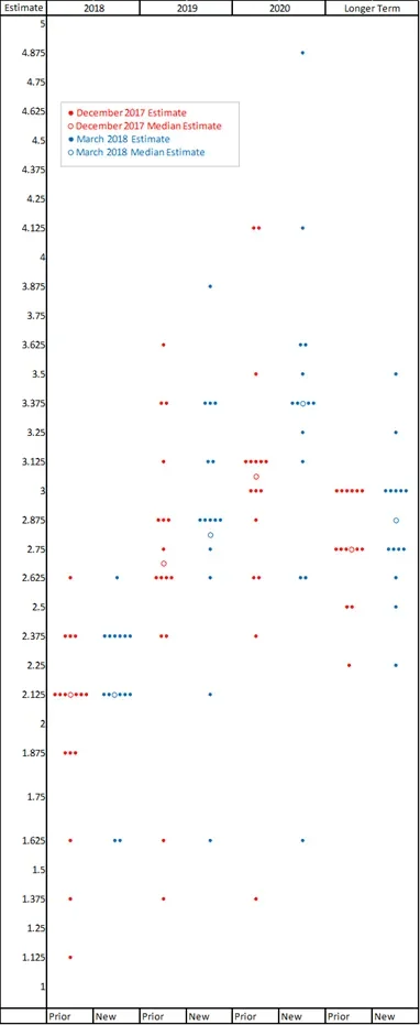
Last Wednesday the Fed raised interest rates in the US for the sixth time since it began this hiking cycle at the end of 2015. This FOMC decision was almost completely priced in by the markets, but investors still watched the press conference carefully for any hints about the future path of rates and the Fed’s economic forecast. One of the key forward looking publications made was an update to the Fed’s Dot Plot scatter chart, which was last published in December 2017. In this chart, the sixteen members of the FOMC each project their estimation of what they see as the midpoint of where the Fed Funds rate should be at the end of the next 3 years plus the longer term, normalised rate.
The headlines have summarised changes in the chart to – median unchanged in 2018 and one extra hike in 2019. While this isn’t an inaccurate summary, we believe this doesn’t capture the full picture and there is more valuable information to be gleaned if we look closely.
The market places particular importance on the median plots under the assumption that these represent the Chair’s view, but there is no way to be sure of this. It’s worth noting that every FOMC member gets to create a dot for each time period, whether they are a voting member or not. All the dots are anonymous and while some can be linked to individual members, where their public views are particularly direct, there is always an element of uncertainty. While the Chair of the Fed gets to control much of the narrative put out by the Fed and will influence the voting, the dots are produced independently by the membership. Former Chair Janet Yellen is quoted saying “one should not look to the dot plot, so to speak, as the primary way in which the Committee wants to or is speaking about policy to the public at large.” Nonetheless, it is worth keeping track of what the dots as a whole are doing beyond the median. We can look for a narrowing or expansion of the range of expectations as well as a general shift up or down.
Source: Federal Reserve
We can see from the chart that while the 2018 median doesn’t move, there is a clear shift away from lower estimates. In December, six members thought 1.875% or lower was their best estimate of the midpoint of where the Fed Funds rate should end 2018; now only two members have held onto this view. Previously four members had 2.375% or higher as their estimation, and now seven members sit above the median. There has undoubtedly been a shift to the upside in the committee’s thinking even over 2018.
Turning to the 2019 projections, we can see much more of a spread of estimations about the midpoints, but again a shift higher across the board is apparent. Six members now see the Fed Funds rate at 3.125% or higher, compared to four members 3 months ago. Only two members see 2.375% or lower, compared to four members previously.
What we find somewhat puzzling is that while both the 2020 and ‘Longer Term’ plots have shifted upwards – they still show us an estimation that the Fed Funds rate over the longer term will sit below where it ends 2020. The median for end 2020 is 3.375% while the Longer Term estimate is 2.875%. Does the Fed want to signal that it expects policy will need to be more aggressive than average in the coming years than the natural rate? If so, they are showing us their conviction about a pickup in inflation and implying more bear flattening to come.
About the author

About the author